 |
| The orange/yellow haze serve to represent danger and mystery "Why?" you ask, well read this post to learn. |
Oh mise-en-scene. That curious thing Wes Anderson owes his entire career to. The thing that every Instagram Film page won't shut up about, especially in regards to this scene (featured to the side) from Bladerunner: 2049, which I have yet to see and by this point I am just too ashamed to admit it to others because they would definitely judge me for.
So as I sat here wondering: when am I gonna include the "Color palette" picture? I decided: why not at least get to know the basics and history of color at the start and use it as a segue to the rest of the blog post.
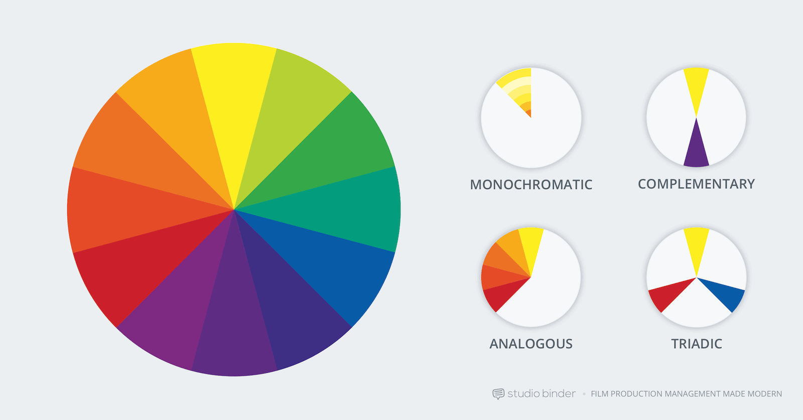 |
| Credit: https://www.studiobinder.com/blog/how-to-use-color-in-film-50-examples-of-movie-color-palettes/ |
1. Complementary: Contrasting colors that serve to highlight one another; the color directly opposite of a specific color on the wheel (example: red and green).
2. Monochromatic: Single, dominant color (see the Blade runner picture above for perfect example).
3. Analogous: neighboring/similar colors on the wheel (example: red and purple).
I highlight these two terms because my discussions with Tstock have centered around maintaining a consistency of colors, either in both how the footage is graded/how the character is dressed or at least the wardrobe. As a result, thanks to my color wheel knowledge, I know I need an e very narrow palette: a monochromatic wardrobe WILL be present, so I could choose to grade certain footage in a contrasting color at the climax of the film (which according to "No Film School", conveys mystery or transformation which is what I need for the climax). An analogous color could be the reds from the blood. With a full understanding of the color wheel, I can now more strategically select colors and learned some cool terms to throw around in college media courses. jokes aside, the color wheel is/will be useful to understand how to combine and tailer a color-based aesthetic, and that's just with the BASIC color wheel (for complex wheel, see below).

Since the introduction of color to film in 1939, the use and psychology of color has evolved with it. To dive into this, let's look at the facts a color scheme can:
- Elicit psychological reactions
- Draw focus to significant details
- Set the tone of the movie
- Represent character traits
- Show changes or arcs in the story
And that's just scratching the surface. Before applying these, let's learn about the three components of color in cinema, HSB. HSB, in essence, is:
1. Hue-The actual color
2. Saturation-the intensity of that color
3. Brightness-how light/dark a given color is.
Here, we see how each of these three aspects contribute to the interpretation of colors in films.
Now each color can mean something and that would take me too long to list so I will let this video do it for me, as well as the links I paste below!
Anyways, after this post, I feel like I can more officially claim to be an authority on film colors in front of friends, family, or the occasional social gathering I will ruin by asking people what they thought of Kill Bill.
Anyways, see ya next time when I can properly say bye to y'all.
Anyways, see ya next time when I can properly say bye to y'all.
Research resources:
No comments:
Post a Comment